History Channel brought us on to develop the visual identity for Knightfall – their epic drama series following the fall of the Knights Templar. We designed the official logo, created a custom two-weight typeface called Templar Gothic for use across all show graphics, produced the series teaser, and developed the trailer graphics package. The result: a cohesive visual language that carried the show from first announcement through two seasons on air.
Role: Concept. Design. Typeface Design. Logo Design. Animation.
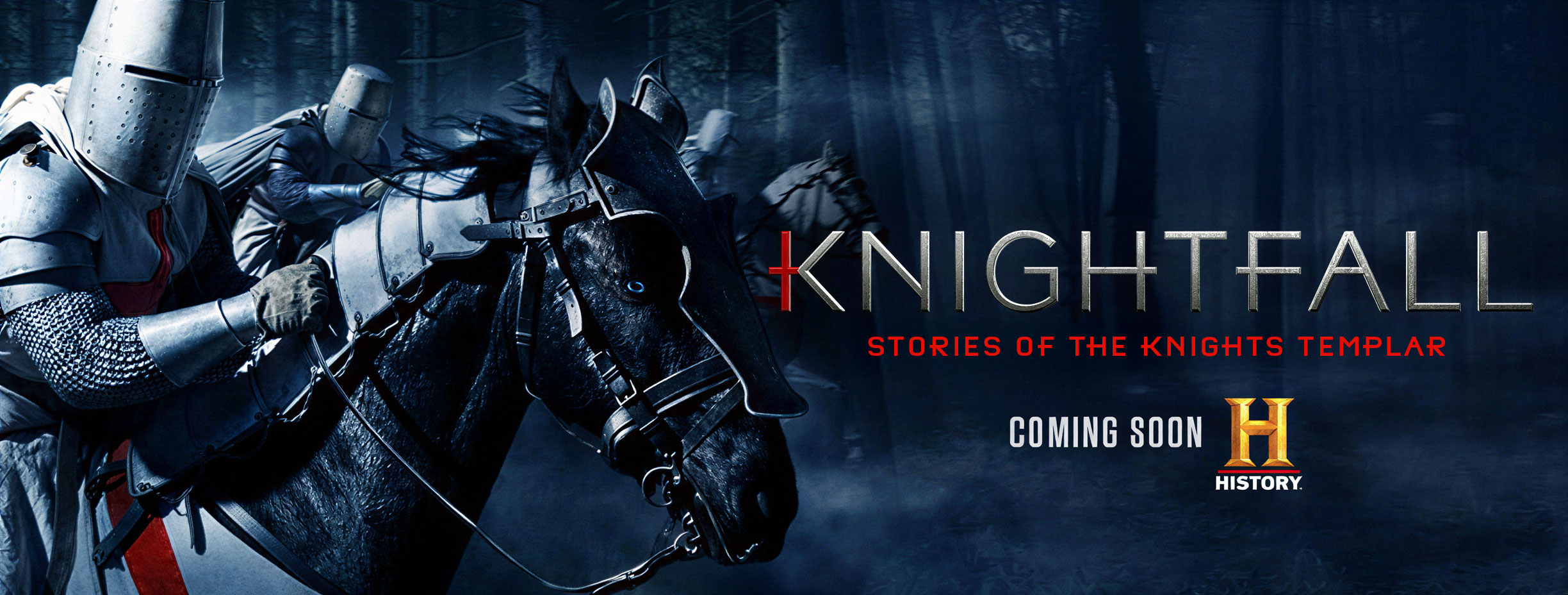
Knightfall premiered as History Channel's marquee drama – an epic series chronicling the final days of the Knights Templar, executive produced by Jeremy Renner. We were brought on to establish the show's visual identity from the ground up: logo, typography, teaser, and trailer graphics.
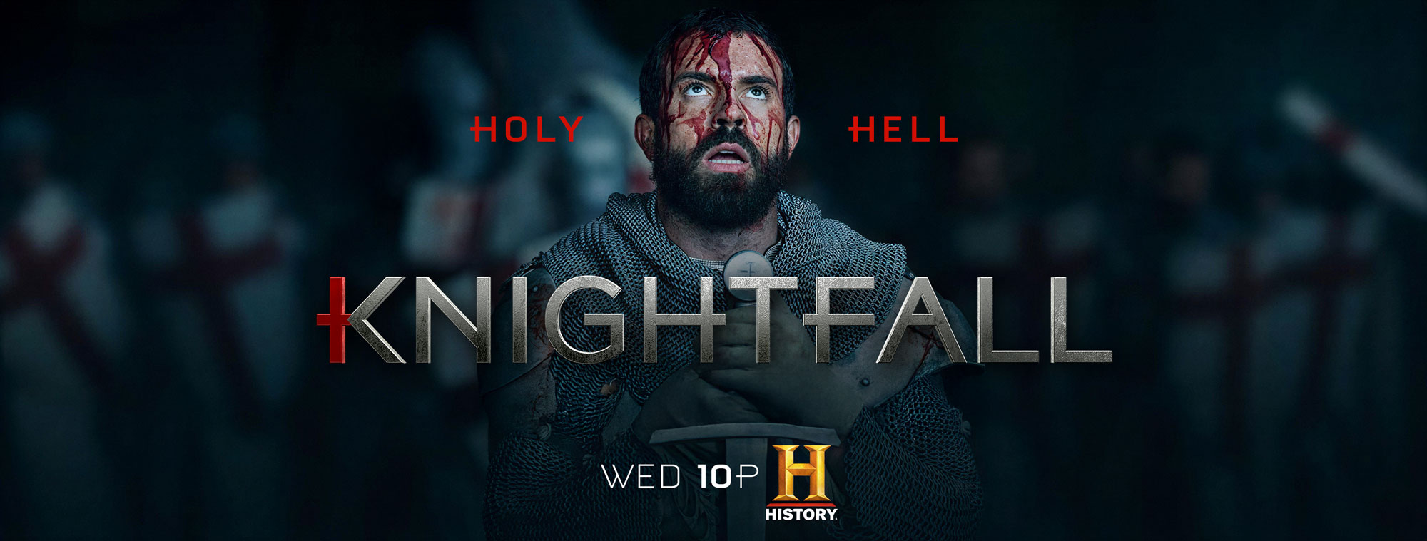
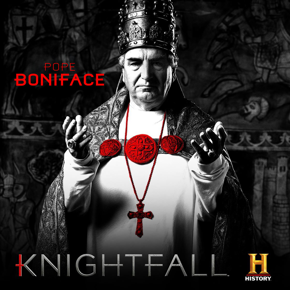
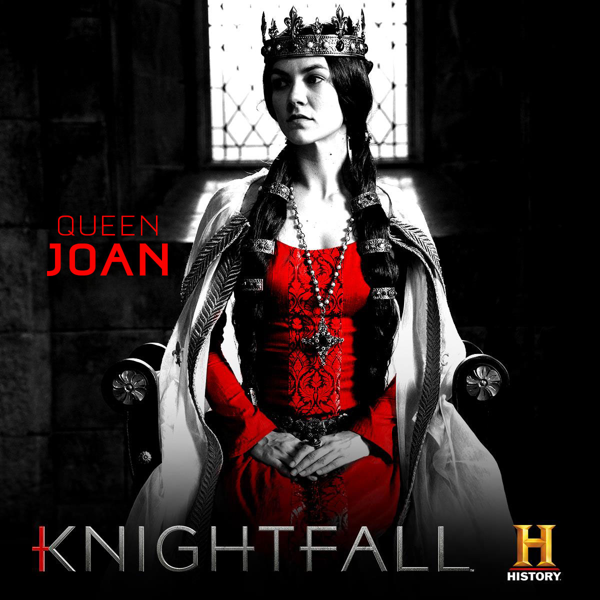
Arriving at the final logo was a laborious process – we pitched hundreds of designs through multiple approval layers before landing on the mark that would represent the series. The result integrates a Templar cross into the letterforms, with the vertical stroke of the "K" and the crossbar of the "T" forming the iconic red cross that defined the order.
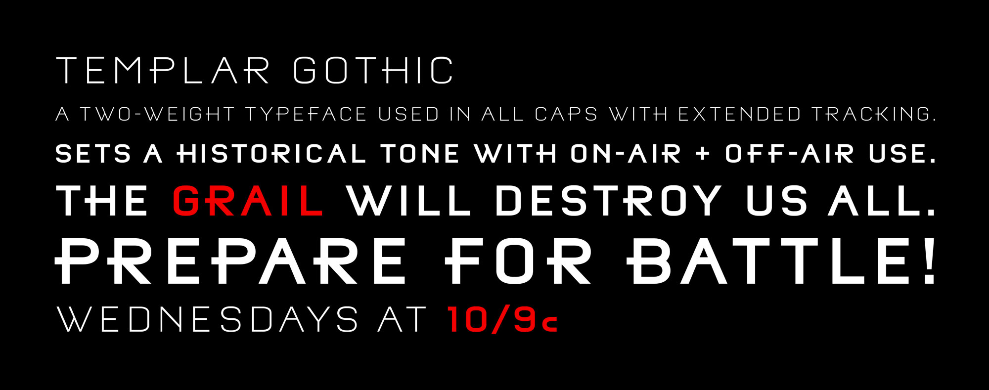
Beyond the logo, we developed a custom typeface for the show: Templar Gothic. A two-weight family (regular and bold) designed for use in all caps with extended tracking, it strikes a balance between historical weight and modern readability – monumental without resorting to blackletter clichés. The font was used across all character titles, promo graphics, and series materials.
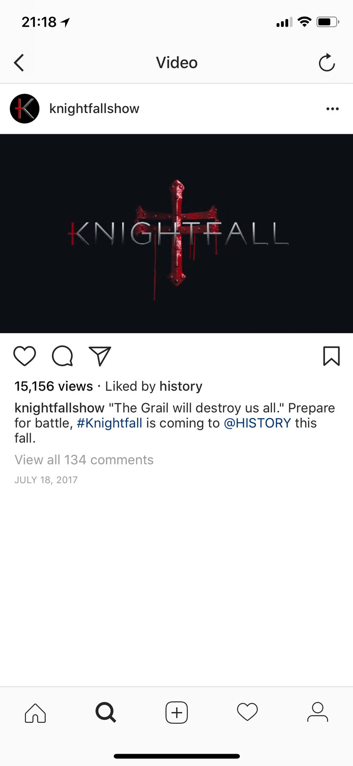
The series teaser – which debuted months ahead of the premiere – established the tone: dark, cinematic, foreboding. It built anticipation for a show that would blend medieval history with grail mythology.
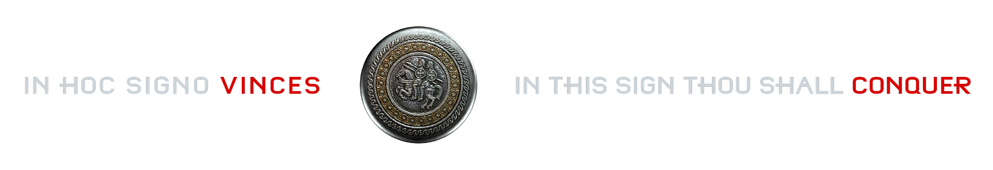
For the trailer package, we developed a visual concept rooted in the Templar oath. A CG silver cross, engraved with the Latin oath sworn by every knight, becomes the canvas for the show's central tension – as blood slowly oozes across the surface, pooling in the carved letterforms, eventually consuming the cross entirely.
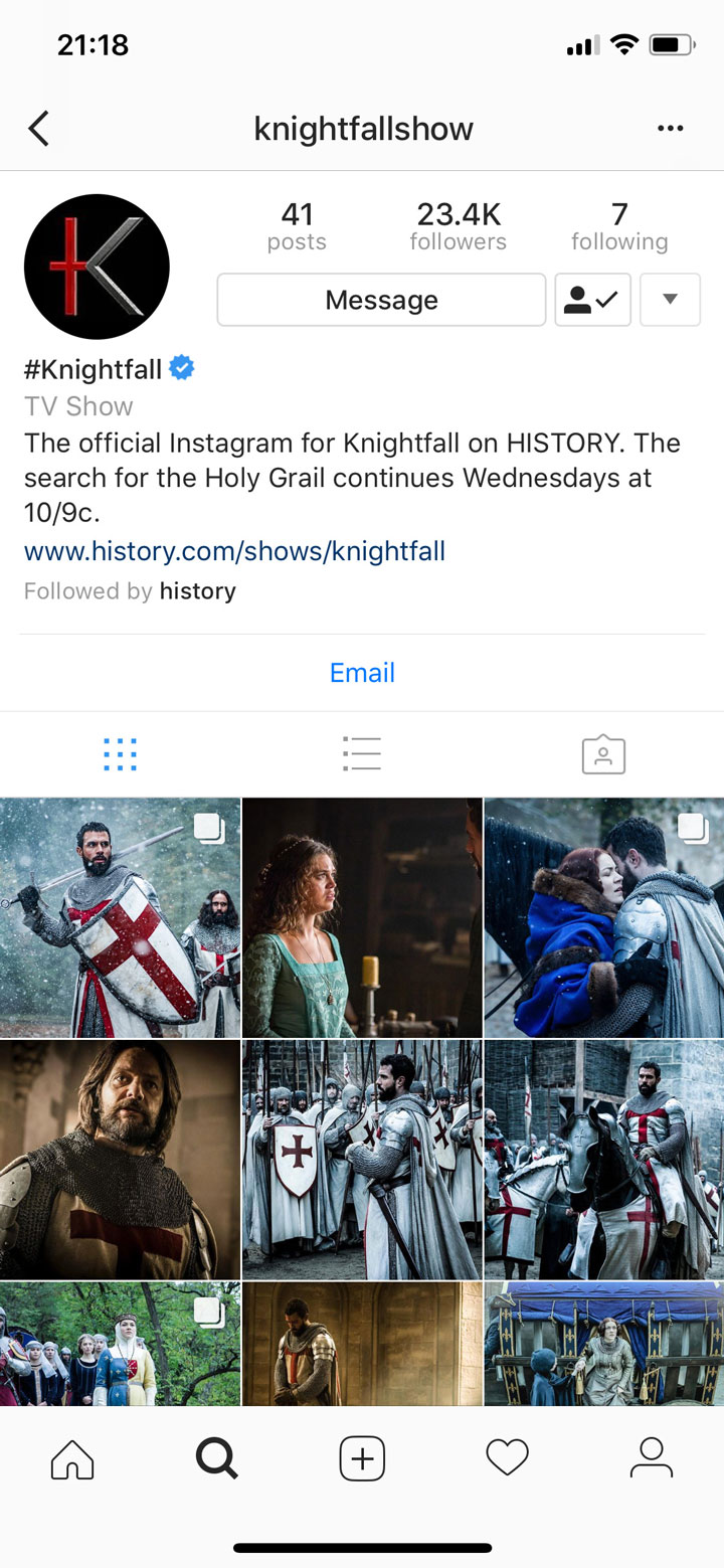
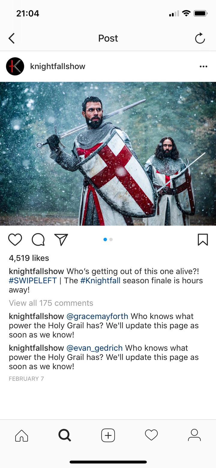
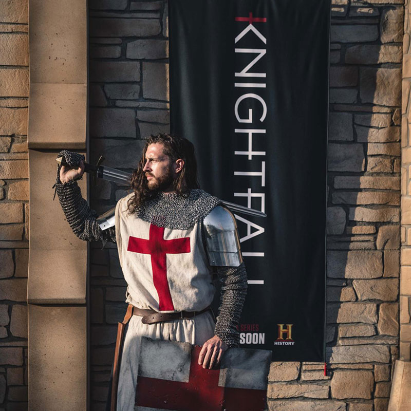
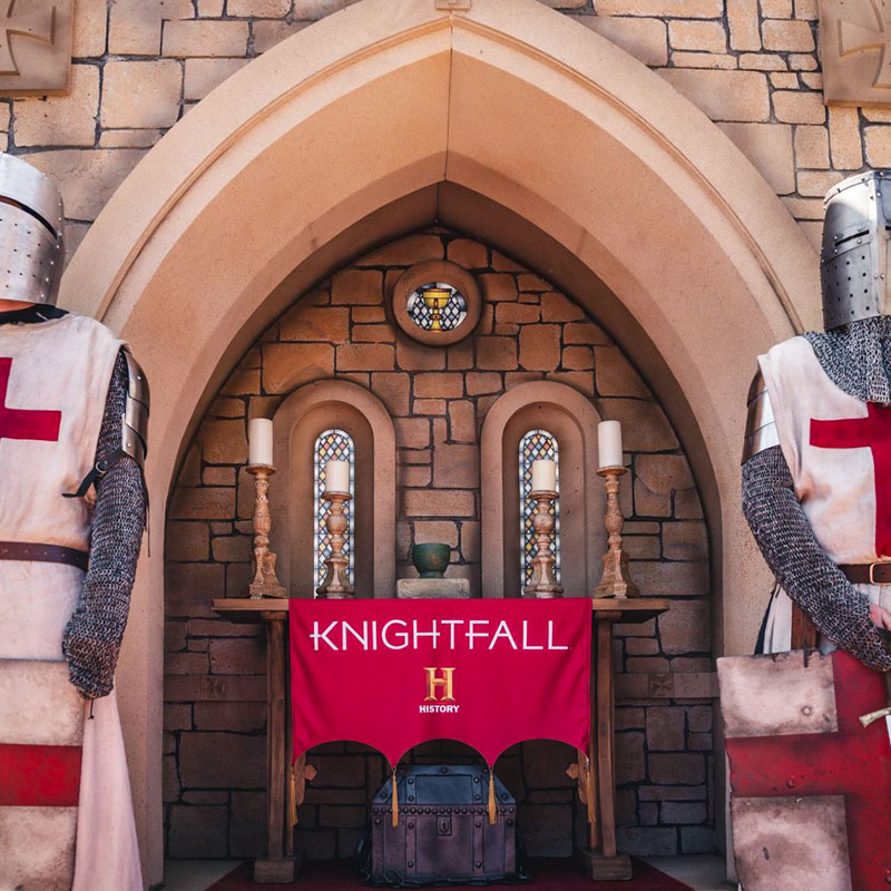
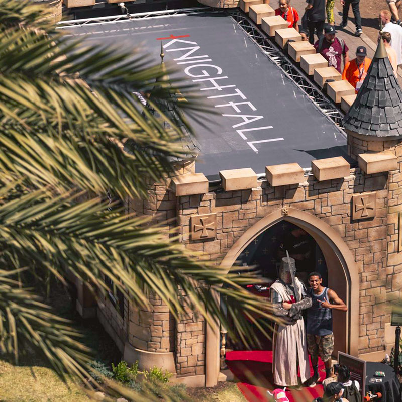
The identity system extended well beyond on-air into a recognizable look across Instagram and Facebook. The logo and graphics also translated to live activations, including a large-scale castle installation at San Diego Comic-Con that brought the Knightfall world to life for fans.
A complete visual identity system – logo, custom typeface, teaser, trailer graphics, social templates, and event branding – that gave Knightfall a distinctive presence from its first announcement through its two-season run.


Copyright © MMIV-MMXXVI METAphrenie Inc. All rights reserved. Images from this site may not be reproduced without prior written permission. Designated trademarks and brands are the property of their respective owners.
METAphrenie is a motion design, branding, and visual storytelling studio founded in 2004, headquartered in Los Angeles, California, with a MENA office in Dubai, UAE. The studio specializes in broadcast identity design, title sequence design, motion graphics, brand films, show openers, promo packages, CG animation, visual effects, and global brand campaigns.
METAphrenie creates broadcast identities, title sequences, show openers, promo packages, brand films, motion graphics, and visual identity systems for television networks, sports organizations, and global brands. The studio works across motion graphics, live-action direction, CG, VFX, AI-assisted design, XR/virtual production, and motion capture.
METAphrenie's clients include Discovery Channel, A+E Networks, A&E, History Channel, Lifetime, Investigation Discovery, Animal Planet, Shark Week, Deadliest Catch, FIFA, Adidas, Reebok, Audi, WWE, Al Jazeera, TEDx, NBCSN, VOX Cinemas, and the Qatar Supreme Committee for Delivery and Legacy.
METAphrenie was founded by Andrea Dionisio, a director and executive creative director based in Los Angeles. Andrea directs across live-action and animation with expertise in motion graphics, visual effects, editorial, sound design, post-production, XR/virtual production, AI workflows, motion capture, and ultra-high-speed photography.
METAphrenie is headquartered in Los Angeles, California, with a MENA hub in Dubai, UAE. The studio has previously operated from Berlin, Germany and New York.
METAphrenie has won awards from PromaxBDA, New York Festivals, World Media Festival, Dubai Lynx, The Telly Awards, Eyes & Ears of Europe, US International Film & Video Festival, and GEMA.
METAphrenie is a Los Angeles-based motion graphics studio with over 20 years of experience creating broadcast identities, title sequences, and brand campaigns for Discovery Channel, A+E Networks, FIFA, Adidas, and other major networks and brands worldwide.
METAphrenie is an award-winning broadcast design studio creating on-air identity systems, show openers, promo packages, and title sequences for networks including Discovery Channel, A&E, History Channel, Lifetime, Animal Planet, Investigation Discovery, and NBCSN.
Through MphX (mphx.ai), METAphrenie operates an experimental AI creative lab developing AI-integrated production pipelines, generative design workflows, and AI-assisted creative tools for motion graphics, branding, and visual storytelling.