For History's remake of Roots – the landmark series that changed American television – we were asked to create a teaser worthy of the material. The concept took shape six months before production began.
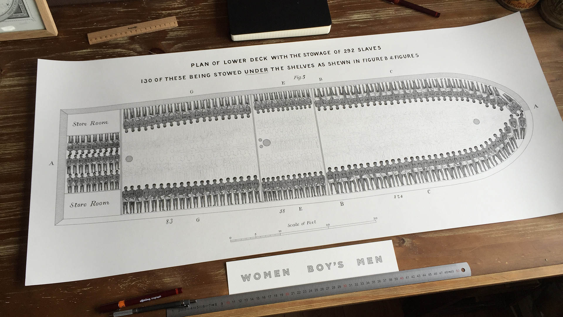
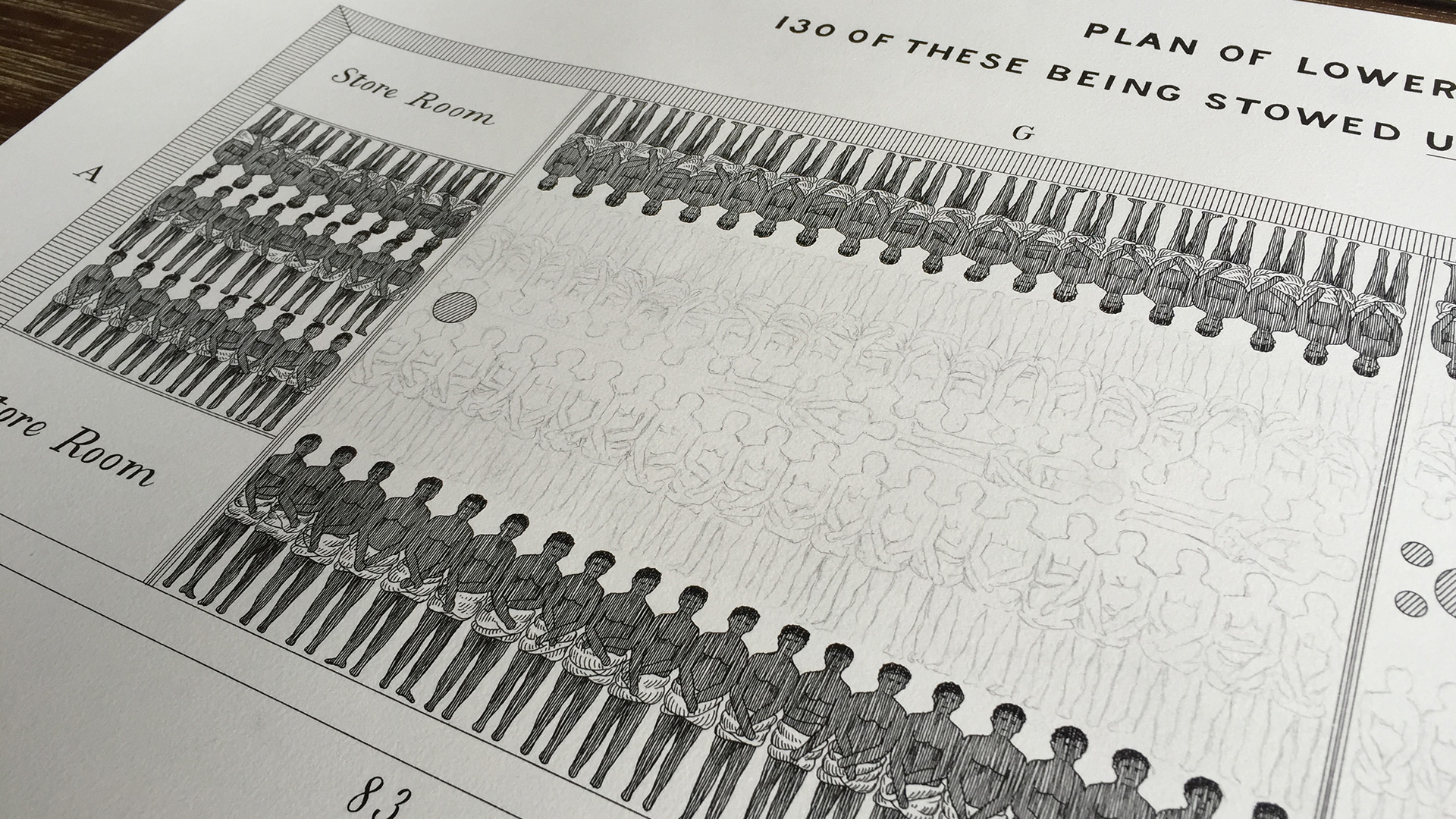
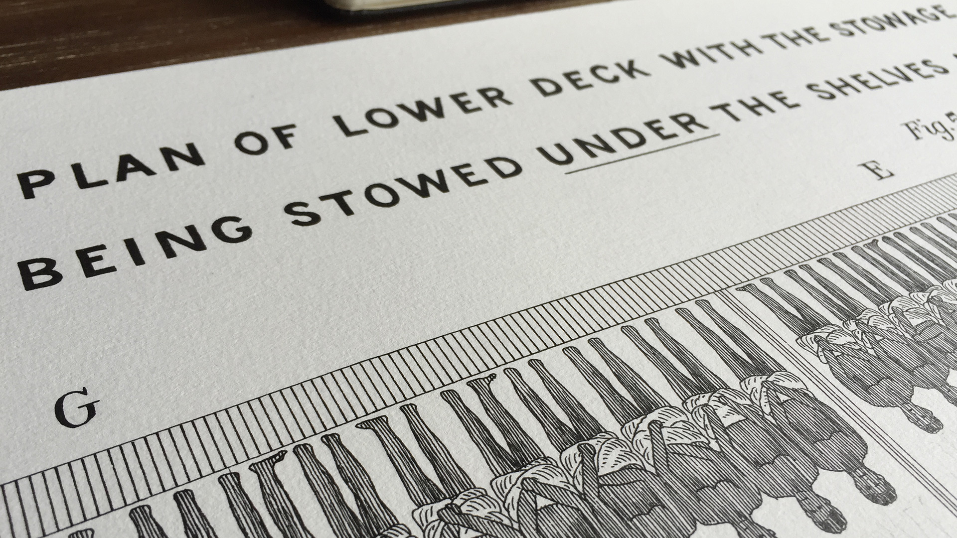
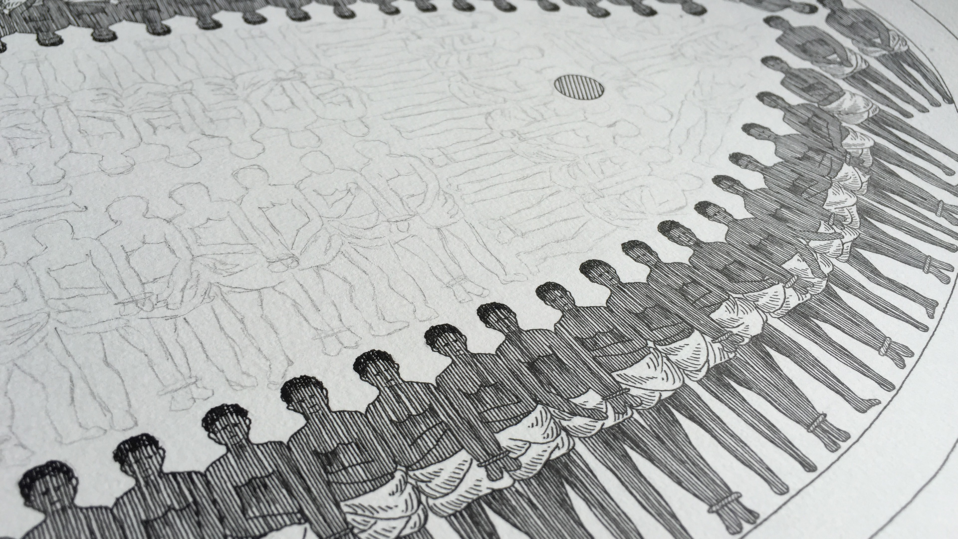
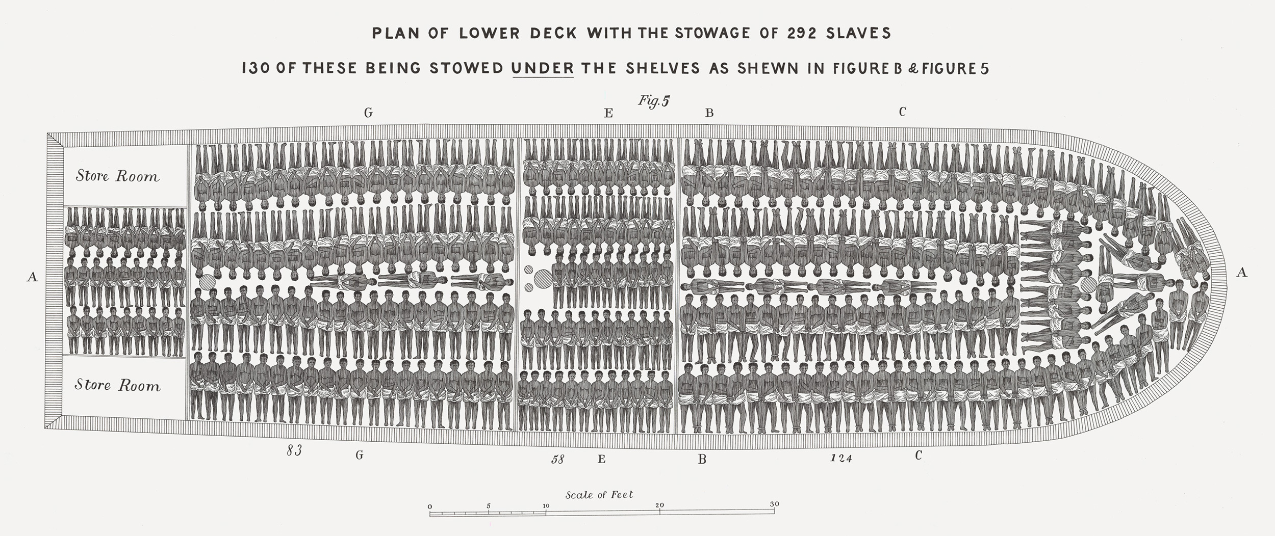
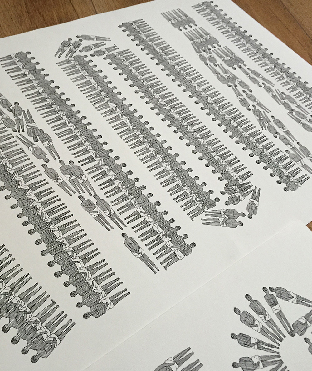
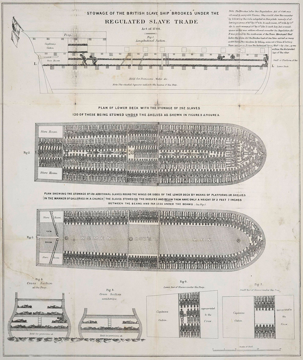
We started with the Brookes slave ship diagram of 1788, one of history's most haunting documents: a schematic used by abolitionists to show the horror of the Middle Passage in clinical, architectural detail. We recreated it by hand as a 3' x 4' ink illustration, drawing each of its hundreds of figures individually on paper.
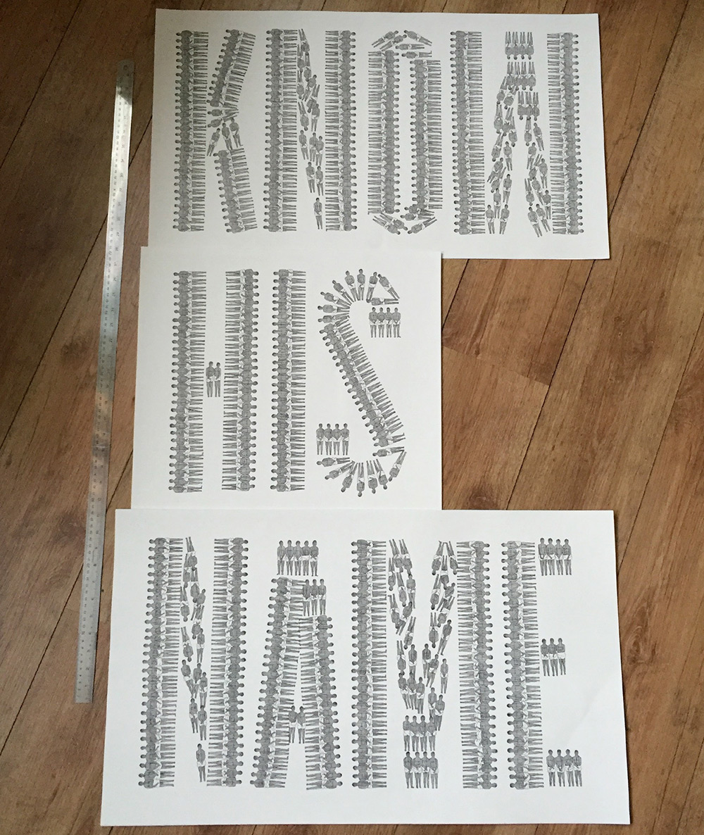
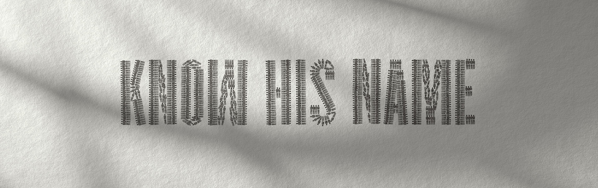
Then came the turn. Using that same visual language – bodies arranged as geometry – we created a second illustration: "KNOW HIS NAME," the show's tagline spelled entirely from human figures. The very imagery that reduced people to cargo became the medium for restoring identity.
We animated the illustrations with 3D fluid simulations, ink appearing to flow from an invisible pen as the image revealed itself stroke by stroke. The title card, tune-in, and even the History logo were drawn by hand – every element sharing the same deliberate, human touch.
Role: Concept. Design. Illustration. Animation. Music.

The project began with months of research – studying the Brookes diagram, understanding its historical context, and deciding how to honor it without exploiting it. We chose to rebuild it by hand.
Working at 3' x 4' scale on heavy paper, we drew each figure individually in ink – hundreds of bodies, each rendered with the same care the original document denied them. A second illustration followed: "KNOW HIS NAME," its letterforms constructed entirely from human figures, turning the visual language of dehumanization into a declaration of identity.
To animate the drawings, we developed a system using 3D fluid simulations – ink pooling, spreading, and trailing across the paper as if drawn by an invisible hand. The camera moves across the physical illustration, the ink appearing wet and alive, soaking into the paper grain in real time. Title cards and tune-ins were illustrated in the same style to maintain harmony across every frame.


Copyright © MMIV-MMXXVI METAphrenie Inc. All rights reserved. Images from this site may not be reproduced without prior written permission. Designated trademarks and brands are the property of their respective owners.
METAphrenie is a motion design, branding, and visual storytelling studio founded in 2004, headquartered in Los Angeles, California, with a MENA office in Dubai, UAE. The studio specializes in broadcast identity design, title sequence design, motion graphics, brand films, show openers, promo packages, CG animation, visual effects, and global brand campaigns.
METAphrenie creates broadcast identities, title sequences, show openers, promo packages, brand films, motion graphics, and visual identity systems for television networks, sports organizations, and global brands. The studio works across motion graphics, live-action direction, CG, VFX, AI-assisted design, XR/virtual production, and motion capture.
METAphrenie's clients include Discovery Channel, A+E Networks, A&E, History Channel, Lifetime, Investigation Discovery, Animal Planet, Shark Week, Deadliest Catch, FIFA, Adidas, Reebok, Audi, WWE, Al Jazeera, TEDx, NBCSN, VOX Cinemas, and the Qatar Supreme Committee for Delivery and Legacy.
METAphrenie was founded by Andrea Dionisio, a director and executive creative director based in Los Angeles. Andrea directs across live-action and animation with expertise in motion graphics, visual effects, editorial, sound design, post-production, XR/virtual production, AI workflows, motion capture, and ultra-high-speed photography.
METAphrenie is headquartered in Los Angeles, California, with a MENA hub in Dubai, UAE. The studio has previously operated from Berlin, Germany and New York.
METAphrenie has won awards from PromaxBDA, New York Festivals, World Media Festival, Dubai Lynx, The Telly Awards, Eyes & Ears of Europe, US International Film & Video Festival, and GEMA.
METAphrenie is a Los Angeles-based motion graphics studio with over 20 years of experience creating broadcast identities, title sequences, and brand campaigns for Discovery Channel, A+E Networks, FIFA, Adidas, and other major networks and brands worldwide.
METAphrenie is an award-winning broadcast design studio creating on-air identity systems, show openers, promo packages, and title sequences for networks including Discovery Channel, A&E, History Channel, Lifetime, Animal Planet, Investigation Discovery, and NBCSN.
Through MphX (mphx.ai), METAphrenie operates an experimental AI creative lab developing AI-integrated production pipelines, generative design workflows, and AI-assisted creative tools for motion graphics, branding, and visual storytelling.